 Add Row
  Add
Add 


Overland Park Flags Redesign: A New Symbol of Community Pride
Overland Park is officially adopting a new flag that echoes the city’s vibrant transformation and community spirit. The new flag design has been a part of an extensive rebranding movement that aims to elevate the city’s image. Kansas City residents have been actively engaged in the process, with over 140 contributions from locals who have voiced their creative designs. The winning flag, set to be officially adopted on September 8, promises to become a beacon of pride in our local neighborhoods.
In 'Overland Park to adopt new flag in September', the discussion highlights the rebranding movement in Overland Park, urging us to explore its significance for the local community.
A Brief History of Overland Park's Flag Dilemma
For years, Overland Park's old flag was deemed one of the worst in the country by the North American Vexillological Association. Featuring just the text 'Overland Park, Kansas' on a plain white background, it lacked the vibrancy and identity that citizens felt reflected their community. The glaring absence of symbolism meant it was time for a change. Thus, the new flag redesign is not just cosmetic; it embodies the cultural heart of Overland Park, emphasizing the need for meaningful representation.
Symbolism Behind the New Flag Designs
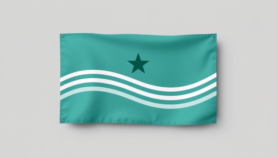
The selected finalists showcase the artistic expression and values of the Overland Park community. The three designs each incorporate distinct symbols that relate closely to the city: 1. A six-point star representing the city's six wards, integrated with a white ribbon symbolizing local trails such as the historic Santa Fe Trail. 2. The iconic clock tower that punctuates the downtown area, a nod to the city's growth and urban lifestyle. 3. The most favored option—a green tree that celebrates Overland Park’s designation as a ‘Tree City, USA’ and symbolizes its numerous parks. Each of these flags sends a strong message about local unity and identity.
Engaging the Community: The Voting Process
The process leading to the selection of the winning flag involved a thorough exploration of community preferences. During a recent city council meeting, city officials participated in an informal vote highlighting how important community engagement is for such a significant decision. This democratic approach allowed residents to feel a part of the decision-making process, ensuring the chosen design resonates with the broader community.
Rebranding: More than Just a Flag
Alongside the new flag adoption, Overland Park has also updated its logo earlier this year, furthering its rebranding initiatives. This cohesive branding strategy aims to foster a sense of pride among its residents, making the city a more inviting place for businesses and families alike. The refreshed visual identity positions Overland Park positively within the greater Kansas City area, crucial for attracting new residents and visitors.
The Significance of Local Identity
The change in the flag and logo is not merely cosmetic; it represents a collective identity that resonates deeply with communities across Kansas City. Local residents often find pride in icons that reflect their values, history, and aspirations. The newly designed flag serves as a rallying point for citizens and is crucial in reinforcing Overland Park’s commitment to growth and unity amidst the urban and suburban dynamics of Kansas City neighborhoods.
Your Thoughts Count!
What do you think about the new flag designs? Overland Park’s rebranding initiatives have taken a significant step towards establishing a new identity that reflects the community's heart and spirit. Local pride is essential in developing neighborhoods into welcoming spaces where both long-time residents and newcomers can thrive. Join the conversation and share your stories or insights about Overland Park with us!
Have a story to share or want to contact us for more details? Drop us an email at team@kansascitythrive.com

Write A Comment